Not to be outdone by the other City Connect releases in the 2024 season, it was the Minnesota Twins’ turn to release their offering. By now, your mind is pretty much made up on the City Connect program. Either you think it’s an innovative way for teams to offer something new to fans or a complete cash grab that features some of the ugliest jerseys you’ve ever seen. Good news! The Minnesota Twins City Connect supports any theory you believe.
So, first impressions fell flat for me. While alternate colors are a common trope used in these things (Saint Louis and the first Los Angeles Dodgers being the major exceptions), the bright blue and yellow accents are almost a too-common theme with these releases. In fact, I mistook these for the Seattle and the Milwaukee numbers. I wasn’t sure what colorway I would use if given the opportunity, but I remember audibly saying the word “pass” when I came across the original hype post on social. I mean, from a distance, does anything about these unis that scream, “Hell yeah, St. Paul is in the building!”. Anyway, the details:
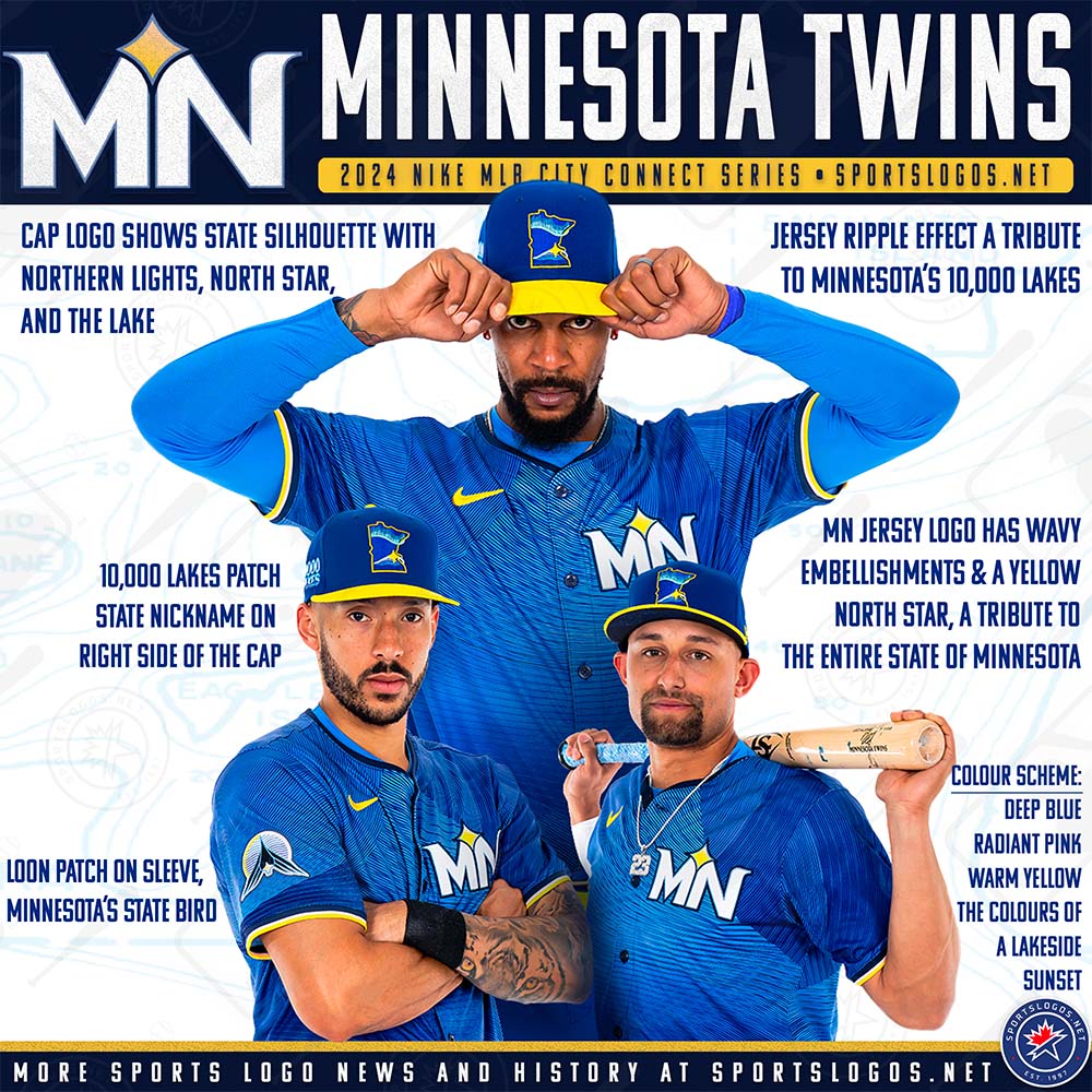
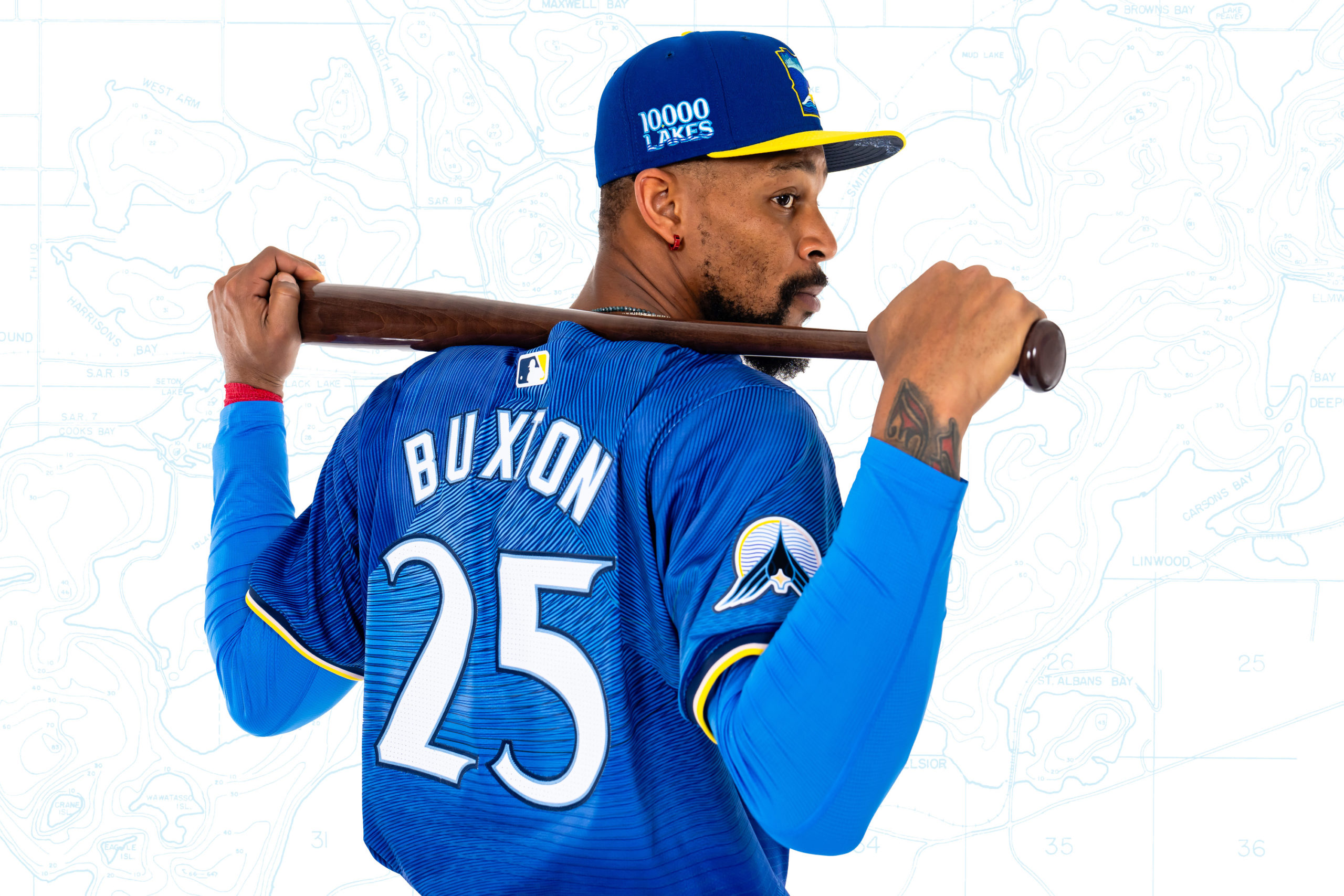
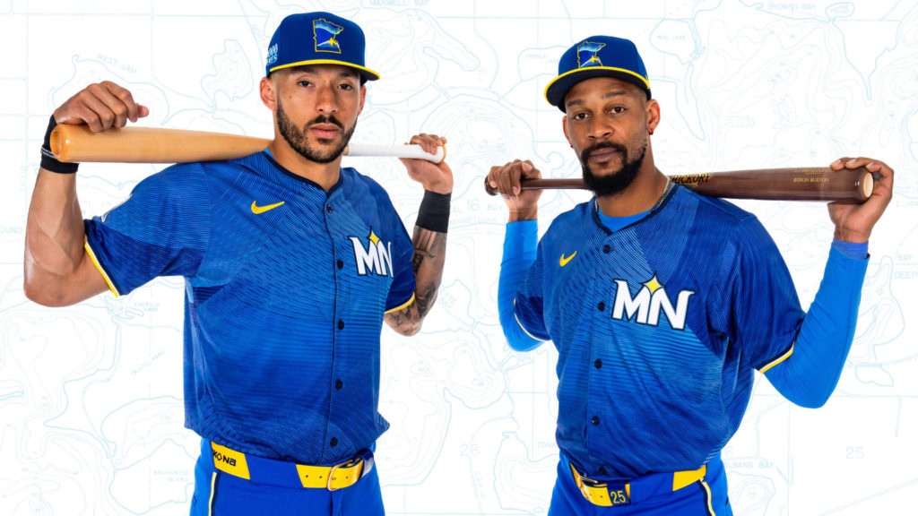
I’m so glad that I typically withhold my opinion of a jersey until I see the design guide and the hype video. In this instance, I’m so glad I did. There was some heavy thought put into the design of these things. You could argue that things here were a bit too packed in, but I digress. Some elements are well-known for the “Land of 10,000 Lakes.” The jock tag says that as much, and it sets the nautical tone for the rest of the setup. Maybe I’m biased, as I’m from New York – known as the Empire State – but I’m not sure how much street cred gets drummed up when a Minnesotan mentions how many lakes they live with. My favorite part of this is the “Loon” patch on the sleeve. The loon is used a lot in Minnesota lore and is the official nickname of the MLS team, Minnesota United. The loon pictured on the patch has baseball seams on its body for those who like to ensure everything relates back to the sport. The chest emblem, the MN with the star in the middle, is pretty striking on the blue base of the jersey. It was wise to stick with the state here (as opposed to trying to force both the cities Minneapolis and St. Paul in there), and the North Star here is a nod to the state motto, “L’etoile du Nord” (lit. Star of the North) as well.
But let’s talk texture. This interweaving pattern on the base of the jersey, a patchwork of hatchings of light blue, dark blue, and white, brings the concept together. The Twins call it “The Ripple Effect,” and it has the semblance of a water crashing on a rock. It would also be interesting if this effect plays equally in person and on television. I like this, and I think more teams should be open to playing with “effects” in the future.
And now the hype video:
I’m not the only one seeing the pattern in these uniform release hype videos. It’s hard not to judge this one individually without trying to compare it to the ones that came before it (and the seemingly formulaic format that goes along with it). That said, there are some smooth attempts to explain why this uni represents the “soul” of the state, and that’s always a plus. Though these are $180 jerseys, you have to make it feel like you’re part of a secret club. In this case, it is a club that likes both hip-hop and nature videos.
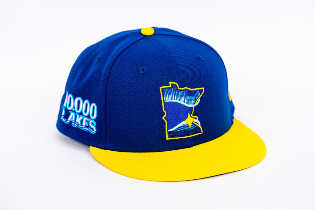
And finally, the cap wisely sidesteps repeating the “MN” chest insignia for yet another symbol to add to the mix. The cap insignia, an outline of the state of Minnesota with a nature scene within that depicts land, a lake, and a north star, stays faithful to the whole “celebration of the beauty of the state” motif that’s happening throughout. Going with my original theory that the City Connect uniforms should be considered more street fashion pieces, it’s the hat that nails it on the hat. I could see this worn in the stands at a game, on a hike in the woods, or on a night in the town. I could’ve done without the comically massive “10,000 Lakes” side patch, but I’m just splitting hairs.
The Minnesota Twins City Connect hits the mark by being both a departure from the standard uniforms and offering fans a new way to align state pride with the love of the team. Even though blue and yellow are a sharp color combination, it’s ultimately weighed down by one (or two) too many elements that are screaming for attention. We got waves, we got birds, we got stars, and we got the whole state showing up to the party. Any combination of one or two of these would be a home run. Altogether, it’s a bit of a cloying affair that just makes me go, “Aight, damn. Y’all must really love the state of Minnesota!” Then again, when it comes to City Connect uniforms, I feel bold designs end up being loved over a period of time, whereas more understated designs are quickly forgotten about.
While I believe this entry won’t top anyone’s City Connect Uniform rankings, this “Ripple Effect” jersey may become a cult favorite.