To be perfectly honest with you, I had forgotten the Dodgers’ second go at the City Connect uniforms hadn’t officially dropped until June 17th of this year. The leaks were out close to a month prior, with some lucky fans already having the jerseys in hand. I always said when it came to leaks (or “leaks”), I would reserve judgment until the official release. And well, allow me to judge away.
With this jersey release, we now have all 29 City Connect jerseys released. (This is the Dodgers’ second entry, and both the Athletics and Yankees didn’t want in on the action.) While I’m positive there are going to be a lot of think pieces ranking the entries, let’s take a moment and focus on what makes this entry different.

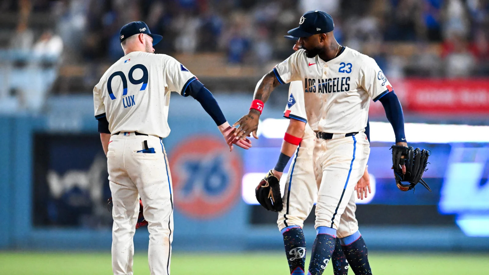
My first impressions are that white jerseys are peak minimalism. You’re either going to think they are streamlined or “clean,” or outright dull. From a distance, I’d say there are other elements that pop. There are two shakes of blue that bisect a “retro-futuristic” wordmark of Los Angeles. There’s also a pop of red on the armcuffs. Speaking of the cuffs, the script “D” makes an appearance as well. As a fashion piece, these jerseys stick out. They draw attention to you and could bring a sporty outfit together. However, at least a couple of things come off just a bit.
I’ve said before that half of the battle of my understanding of these City Connect unis is looking at the “design guide” graphic. It’s the last chance for the powers to be to tell me why their design works. Sometimes, it works for me, but I have to say that this time around, it falls a bit short. Sure the wordmark and the “galaxy of stars” are supposed to let us know that this City Connect is more “celestial.” However, there are so many aspects of Los Angeles that (again!) get passed over here. What about an appreciation for the entertainment industry and Hollywood? What about a tip of the cap to the many diverse neighborhoods within the city limits? What about a nod to the Negro League team, the Los Angeles White Sox? I’ll even take a “LA Noir” theme if you want to do something really unorthodox. Look, the Angels focused on surfing culture and the beach, there’s a WHOLE bunch of SoCal imagery you could’ve borrowed from guys. I don’t know. The Galaxy theme seems unnecessary, especially since the local soccer team has been doing that for years.
We don’t get a mid-tempo reveal hype video that leans on hip-hop culture in an attempt to be cool this go around. We get this instead:

On the surface, they look nothing alike. But if you think about it, you have a bold, white heavy colorway, a “futuristic” font across the chest, a pop of color in an unexpected place (in this instance, the player numbers), and a Shohei Ohtani connection. Maybe I’m just speculating.

The cap combines the classic “LA” insignia with the script “D” which has grown in popularity over the past couple of seasons. Personally, I find the amalgamation a bit busy, but I can say the expression is quintessentially Los Angeles. Collectors would love this, although I’d guess more casual fans would be a bit confused about the mishmash of typefaces paired with that “fin” that extends out of the “A” to bring everything together.
What we’ve learned with the City Connect uniforms is that your mileage will vary with each entry. However, I think it’s not a hot take to say that even though Los Angeles got two chances at City Connects, neither of them would be considered one of the better entries. It’s a shame, really, and while I think a design is in there to really tie the team to the city, I have almost no desire to see a third go-round.