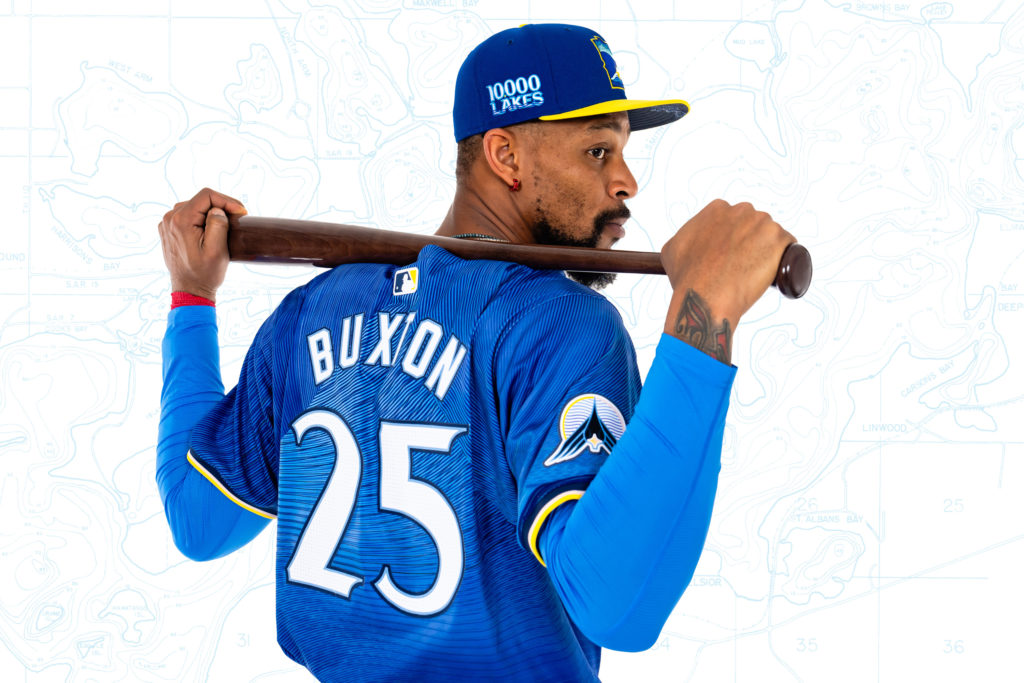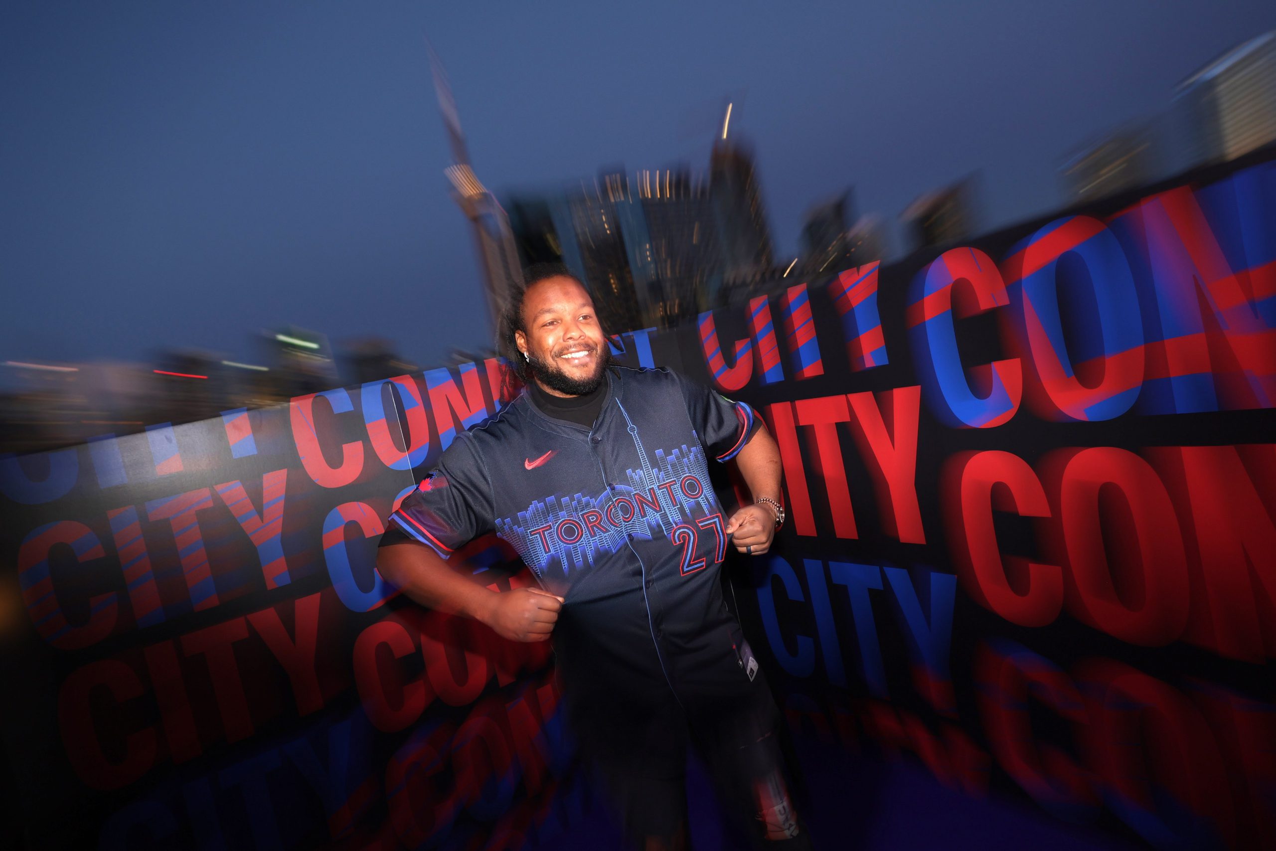
2024’s City Connect lineup rolls on as the Toronto Blue Jays announced the launch of their CC uniforms this Friday. The seventh (not the “6ixth”, sadly) City Connect revealed this season. Toronto decided to lean into the culture of the city at night. We have dark shirts and pants, a bold red trim, and a skyline of the actual city of Toronto. You can’t get more connecting to the city than that. Here’s the release hype video:
“Shang Chi” and “Kim’s Convenience” star Simu Liu not only makes an appearance but takes us through why Toronto is so special. Not to single out the Blue Jays here, but the format of these videos is becoming more and more apparent. You got some celebrities and cameos mixed in with color-corrected shots of the city and players on the roster enjoying their uniforms while a hip-hop beat chills out in the background. It’s a bit derivative and makes you wonder what the intent of the City Connects are. I say they are to offer fans a more “street-forward” jersey than the standard unis. For others, it’s seen as more of a salute to the hometowns of these teams. For the hype videos, it just seems like the mission is “be cool, y’all.”
For the record, I thought the video itself was well done. I loved the highlighting of visual effects on certain aspects of the jersey to help guide our attention. Let’s be honest, a lot of these City Connect jerseys have relied on darker colors, so it was appreciated that even though the kit is known as “Night Mode,” that time was given to underscore the red and blue accents on this one.
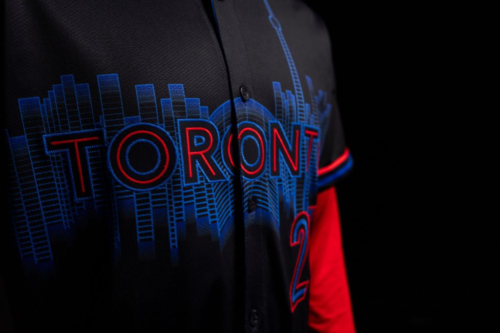
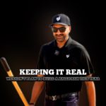
The design elements are striking. The red and white do pop off of the black base. Even though the jersey leaked about a week and a half before the official drop, the jersey looks way cleaner on the players’ bodies featured in the video. This will be one of the few times I prefer a City Connect jersey as something more for the players than a fan-centric piece. In other words, Vladdy Jr. can make this jersey look like a billion bucks. I’ll make this jersey look like I got it at the train station. The CN Tower is also comically tall, but that’s another issue entirely. But let’s talk about the hat:
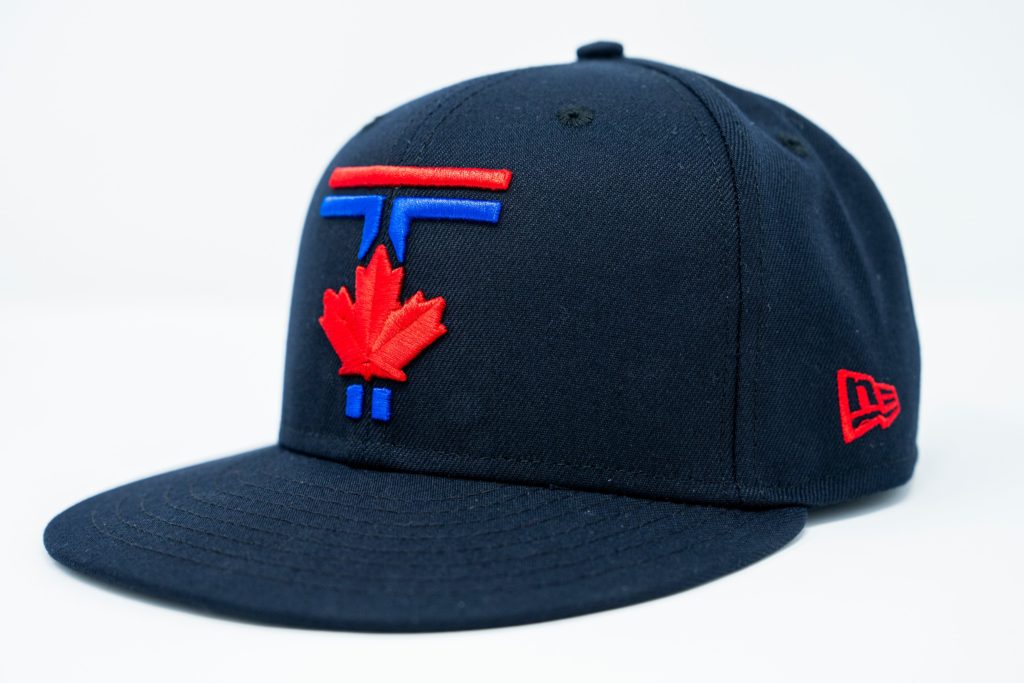
Now, this is what I’m talking about. The elements of the jersey are there: red and blue on black and it features a maple leaf, but it is definitely greater than the sum of its parts. The “T” almost has a mass transit feel, but it defers to the maple leaf in a way that says they are connected. I’d probably buy it as an American, but it feels like it would be a statement piece to someone who was unapologetically Canadian. And that’s the fun part of the whole City Connect program. Whether it hits or misses (or in the case of Toronto, both kinda) when you cop, you should feel a sense of pride for both your team and your city.