Words by Flobo Boyce
We were told by the end of 2024, there will be only two teams left without a City Connect uniform: The Yankees due to their aversion to having fun, and The Athletics, due to their aversion to having a city to connect with. So more or less we are in the home stretch. On May 6th, the Detroit Tigers dropped their City Connect unis, and well, there’s a lot to unpack:
The release video hits the notes that most people associate with Detroit. We got classic cars, we got a love for hip-hop and spoken word on display (a nod to Detroit’s greater music culture), and cameos from city legends which seem to be the theme in these City Connect hype videos. They even got Eminem to make an appearance.
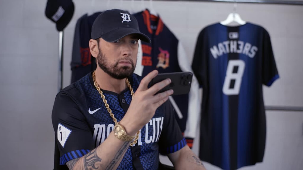
Guess they didn’t want to pay extra to have him look like he was enjoying himself.
Here’s what the team says is the inspiration behind the new unis:
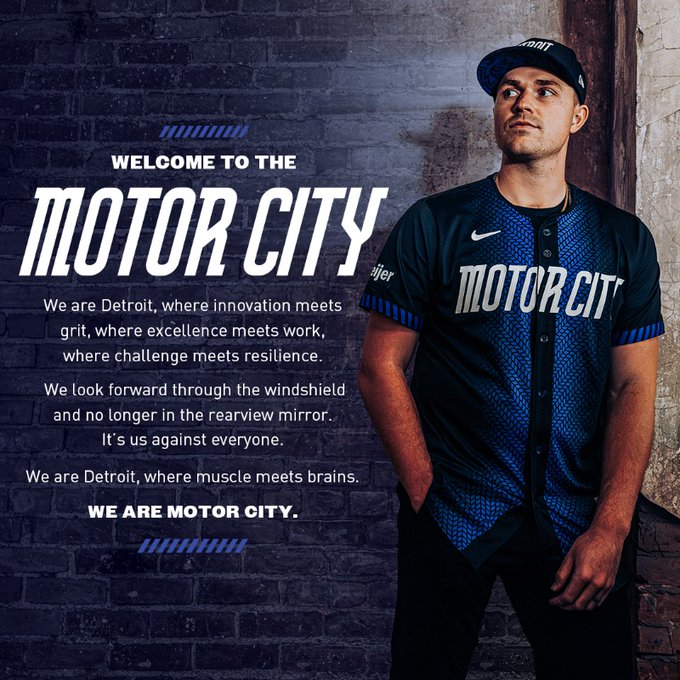
So first impressions of the unis are VERY similar to what I thought of the recently dropped Tampa Bay Rays City Connect uniforms. The Detroit number hits all the right notes, but tries to straddle both a very Top-level association of the city with being as minimalistic as possible. So what you’re ended up with is a bold design, but it doesn’t really feel like you’re unlocking all that much about the city itself beyond the surface. As somebody who’s never been to Detroit as of this writing, maybe I’m looking too much into it. But the standard elements are there: A black and blue gradient that makes it a street fashion piece for more casual fans, automotive elements with the “tire” tread middle third and the “Motor City” chest branding, and a local element with the “313” side patch on the shoulder. All that stuff clears.
I will say that that copy in the above image is kind of stilted though. “Innovation meets grit?” I don’t know about you, but I’ve just about had it with ad agencies using the word “grit” to describe a city. A couple of years ago, the NBA team Brooklyn Nets had their official hashtag “#BrooklynGrit.” I’m sorry but the word grit is overused. At best, it’s a marketing term that puts too many energies in a blender. At worst, it’s completely devoid of meaning. What is grit? Can you share some grit? Can you put grit on layaway? Which town has the most grit invested in the stock exchange?
In all honesty, I do like the jerseys. I had wondered if they would put some elements of the Detroit city flag on the unis, but then I looked up what the flag actually was, and I decided that the color scheme the team chose was the right call. The one thing we have to talk about though, is the hats. What is this?
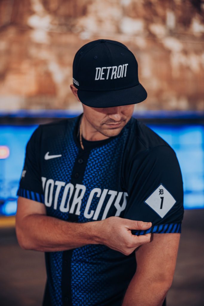
I mean, points for matching the font of the jersey, but if we are taking the uniform as a streetwear piece, there’s almost no scenario where that hat doesn’t look like something you would cop at a local gas station. Which is a shame, because the underbrim (and the jersey jock tag) has an image I think is FAR superior:
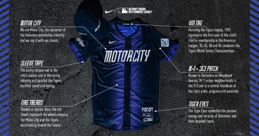
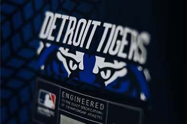

If anything, the “Tiger Eyes” should have been the main artwork on the crown. Sure, there will be people who compare it to the all-time great Lake Elsinore Storm cap design, but at least that’s another sports franchise.
All in all, the Tigers did pretty well with their design in my opinion. I don’t think it’ll make anyone’s Top 5 overall, but definitely is one that could shuffle a few people’s overall ranking lists.
Probably due to the high grit index, honestly.
Words by Flobo Boyce
Flobo Boyce is Senior Contributor to BBM, the host of In the Booth with Flobo Boyce, and many other fantastic creative projects. Follow him now!
