WORDS BY FLOBO BOYCE via Just The Sandwich
I thought I was done this week on The Sandwich. Had an article about the LA Galaxy up, and did a eulogy for the White Sox. I was riding high, already looking forward to next week’s ramblings. But then I forgot it was April 19th, and the Mets had promised their City Connect jersey drops. I was met (heh) with tags from everyone about it. The hype video:
By the way, I love how the video starts off with an argument.
For those who aren’t into baseball, here’s the TLDR: A couple of years ago, Nike decided to release special edition jerseys for every team that would help to “capture” the spirit of the franchise and the city they reside. These were called “City Connect” and while most people already have an opinion on the concept, we can say that the results have been mixed.
Now that the Mets have released theirs, I kind of understand the combination of emotions. When the lo-res leaks appeared online last week, I was less than enthused. I went “oh man, that looks like the Mets trying to be the Yankees again.” This is a sentiment I know most people don’t agree with, but that’s the very reason why I can’t stand our ‘iconic’ Mets pinstripes. Like, leave that design choice in the Bronx, I would say before being promptly shouted down. Today however, I changed my mind over the City Connects. I love them, and there’s two reasons why. The first:
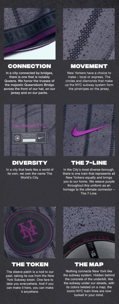
I don’t usually care for “design reasoning” graphics. You know, where a company tries to justify why it overthought a logo, or a concept and sheepishly makes an image hoping you don’t get mad at them. This particular one had the opposite effect for me, because I was able to see the details up close. This just wasn’t “gray,” it was a textured homage to concrete. This just wasn’t a “New York Script” in the under brim, it was a nod to the transit lines. It wasn’t just pinstripes, there were a constellation of circles and diamonds, denoting both the local and express types of trains that exist in the New York Transit System. It kind of reminds me of that defunct soccer team, Queensboro, FC a bit and they were going for a similar vibe.
Side note: I should really write an article about why I hate when American soccer clubs call themselves, “FC” but that is for another day. Anyway, the second reason:
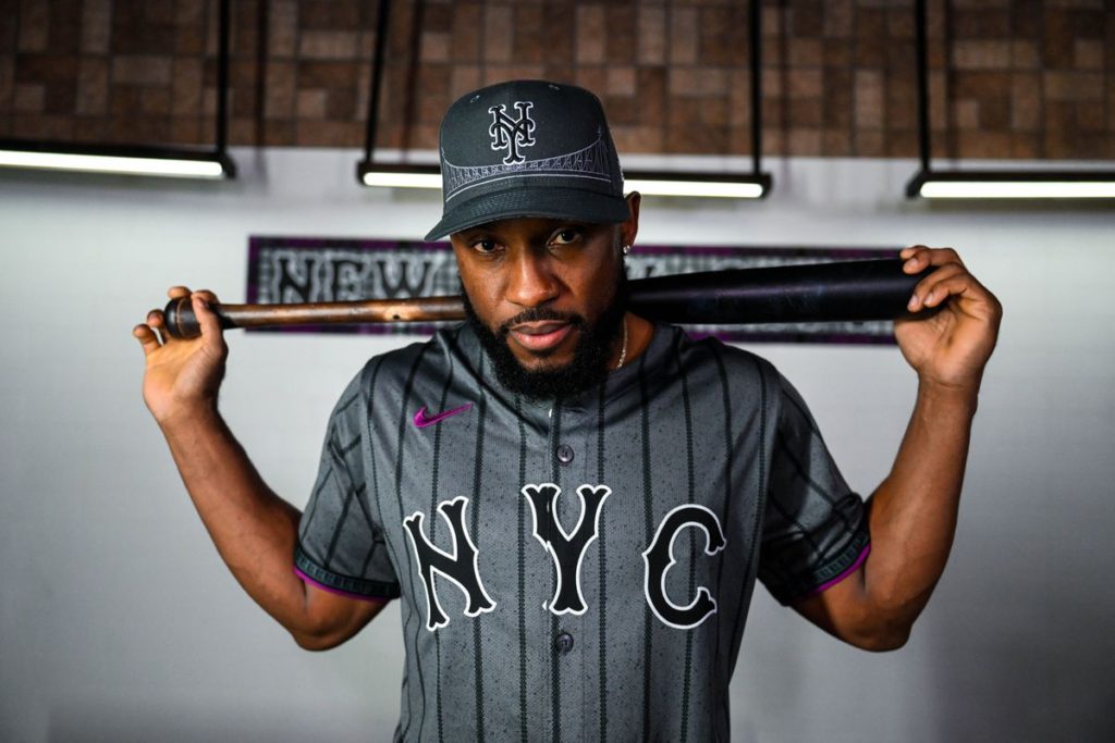
My man Starling Marte. Part outfielder, part fashion nova, everything looks so much cooler when it is part of a Marte Parte!
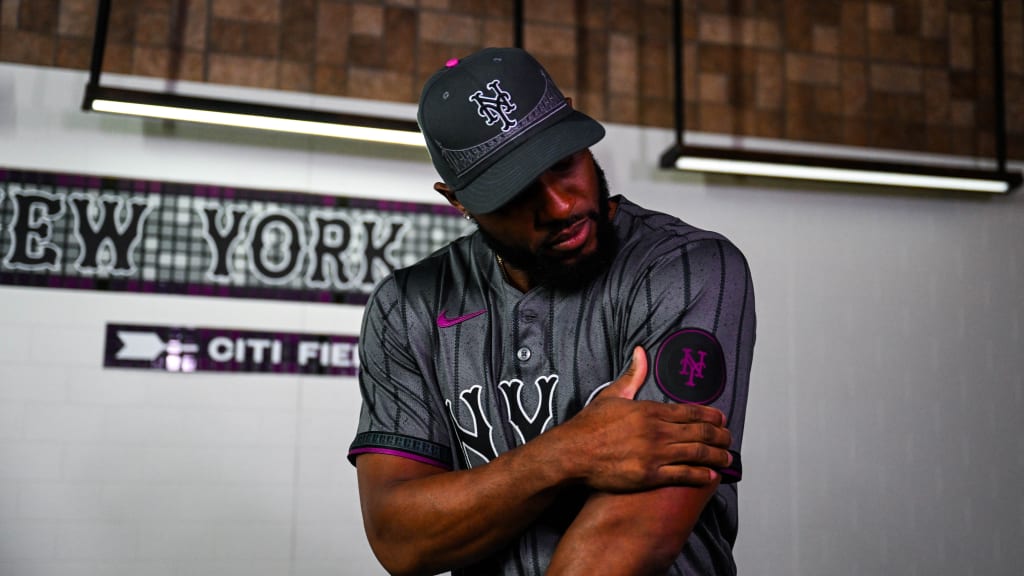
In all seriousness, seeing the Marte photos reminded me that “Sure these are ‘uniforms,’ but these can also be used as fashion or streetwear pieces.” And I know baseball purists hate that, but baseball purists don’t spend the money teams like. Casual fans and cool hunters do. Am I being cynical? Probably, but I can tell you a cool slate gray and purple jersey would probably be in heavier rotation in my wardrobe than the comparatively bright blue and orange jersey I own now.
Lastly, I know there was uproar from people who are upset that the front of the jersey says “NYC” over Queens. I say GET OVER IT. The point of the City Connect is to connect the parts of the city, not divide it.
Anyway, Brooklyn is in the building. I’m out.
#LGM
WORDS BY FLOBO BOYCE via Just The Sandwich


