WHAT IF A CITY CONNECTS UNIFORM WANTED TO RUN FOR PRESIDENT?
Ah yes, the Cleveland Guardians. One of the oldest franchises in the sport, the Guardians have such a beautifully complex history. Thanks to movies like “Major League,” the team (and yes, that includes its former name) is synonymous with the sport of baseball in some circles. However, due to a World Series championship drought spanning over 70 years, Cleveland oddly finds itself outside of the barbershop conversations some of the other, more successful teams get to enjoy. Well, like it or not, the “The Guards” were definitely in the conversation this week as they dropped their City Connect uniforms:

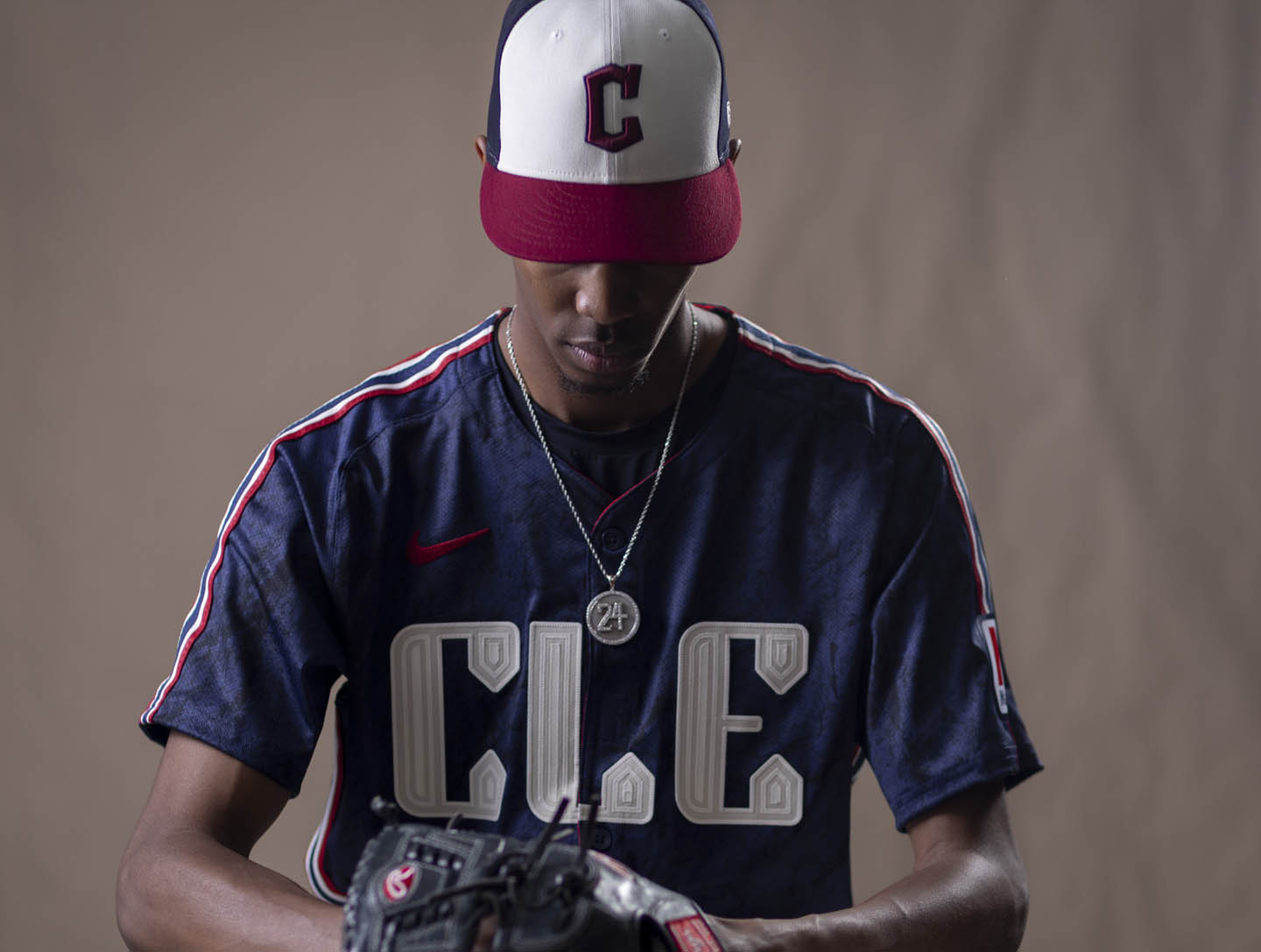
Truth be told, I needed a day to sit on these. First impressions had me looking straight at that “CLE.” I mean, it just pulls your eyes right to the chest in almost an overbearing way. I had no idea people in Cleveland would go so hard for their airport code, but it’s on a shirt that says, “You gonna learn C-L-E today!”
Social media reaction was swift, and it seemed that most of the Guardians fans on the Internet hated the design. I want to offer that, except for the Tampa Bay Rays City Connect, most reactions tend to start off negatively at least. So, putting that aside, let’s check out the splash image the team dropped:
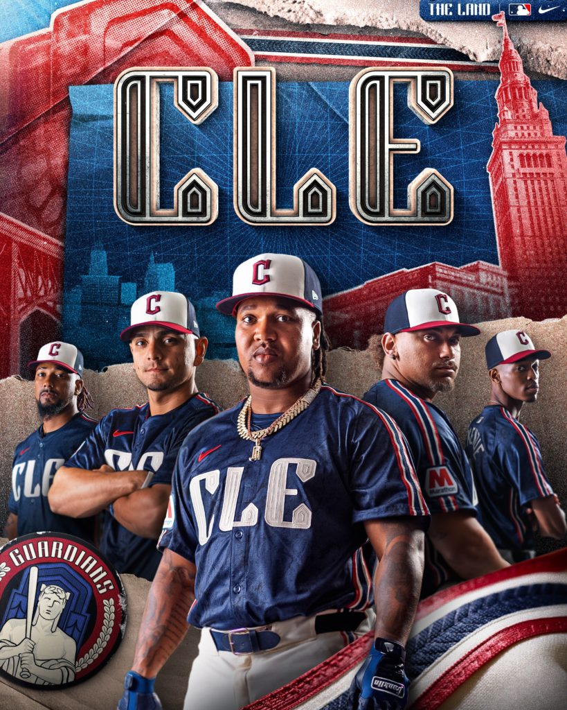
And you know what? When I saw this image… I got it. The colors really do mix well together. A deep sea blue, a white that’s somewhere between “white” and “off-white,” and a red that looks close to either blood or cheap wine really threw a patriotic theme at me, but not aggressively so. In other words, it was more like apple pies and afternoon softball games and less like “Who did you vote for in the last election?” It has a Main Street meets Opening Day bunting vibe that could match with a lot of things in my closet. No matter how you look at the color palette, it leans into Cleveland as a blue-collar town without trying too hard to do so.
I find it interesting that Kid Cudi makes an appearance here as it’s yet another instance of MLB teams featuring rappers in these alternate, street-focused uniform videos. That’s a topic for another time, but I did like Kid Cudi’s appearance here. I’m a fan. In my bar DJ days, “Memories” was the song I’d spin during last call. Good times. Not to mention that former WWE champion The Miz, a Parma, OH native, shows up in the clip as well.
There are some design elements that I think worked for the uniform. So much so that they ultimately swayed me into the “liking it” camp. First was the piping:
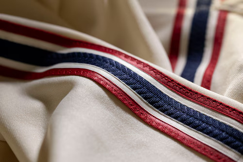
This was an element that was lost on the leaked photos that were released the day before the official drop. Red, white, and blue are always going to be bold together, but the braid gives off more of a “handcrafted” feel. I say feel because I know dang well machines are working overtime to make these available in stores soon, but I digress. From MLB:
The braiding down the sides of the jersey and pants features an intricate design found on the statues and gives a nod to the strength and excitement of the early ‘90s teams.
However, the element that sticks out the most is the Guardians’ City Connect logo.

You know what? If this logo were on a hat, I would rock THAT. When Cleveland changed its name to the Guardians a few years back, they took a lot of heat from fans who were resistant to the change. And while nobody would ever knock the team from being inspired by the Hope Memorial Bridge (aka “The Guardians of Traffic”), the OFFICIAL logo was one of the more questionable ones I’ve ever seen. The City Connect logo completely erases the half-measure and goes in on what the brand identity of the team is going for. Slightly annoyed statue with a bat? Way better than the letter G trying to pitch a vulcan curve. Sign me UP!
I’m starting to think the 2024 City Connect offerings have been the strongest year. What do you think? Let me know in the comments below.
-F
Seriously, though? CLE? What’s wrong with Cleveland on the chest? Or Guardians? The Land? Forest City? The Spiders? I mean ANYTHING would’ve been better there.
